Bay CPA Plus
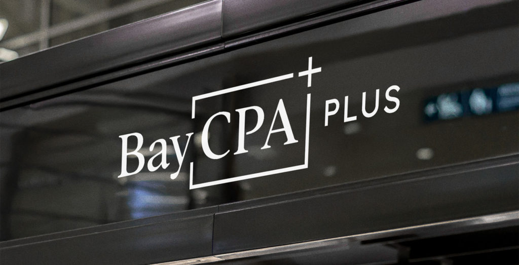
BayCPA+ had a logo that just wasn’t working anymore, and a brand design that didn’t show off owner Sabina’s fun and positive personality. Before expanding to a new location in Redwood City, she knew she needed a change to bring in those high caliber clients, so she hired Buttonwood Creative to refresh the visual identity for her firm.
Help taxpayers – especially those having their own enterprises – to make more profits, pay less taxes and build up financial independence & personal wealth.
bay cpa plus questionnaire
DISCOVERY PHASE

We discovered “Bay CPA Plus” means more than just another CPA. One of their long term goals is to add on services, such as financial planning, speaking and educating.
Their audience is 30+, looking for long term growth, and building up their nest egg.
They wanted to project confidence, trust and professionalism, but also stand out from the crowd of CPAs – emphasizing optimism, friendliness and fun.
DESIGN PHASE
Buttonwood Creative presented multiple design options, including this direction that maintained the optimistic golden color from her previous design (which she already used liberally in her email newsletters), but updated.

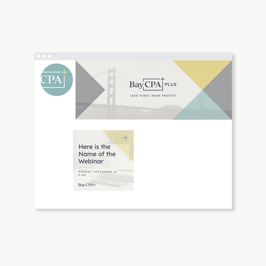
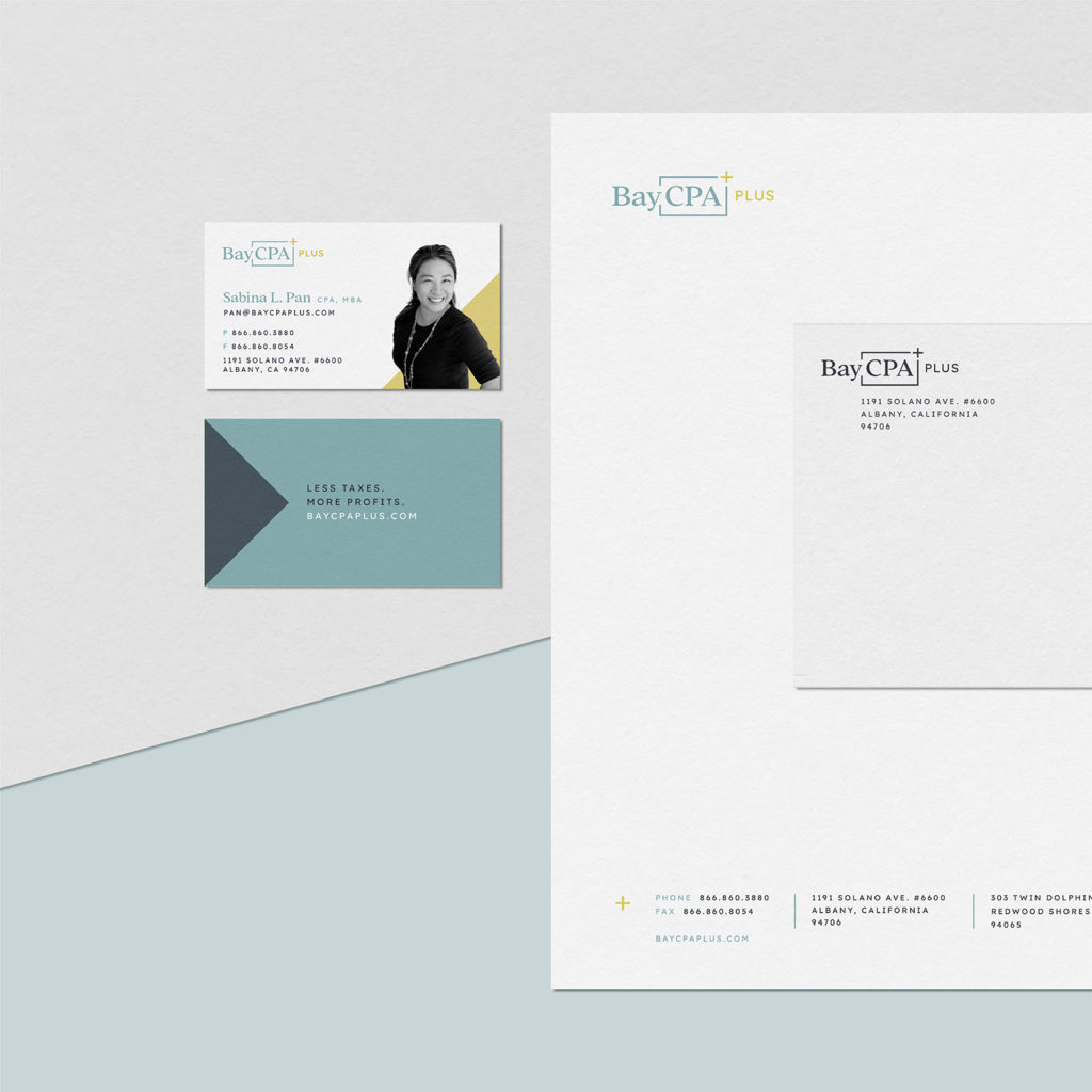
The new BayCPA+ brand architecture included rectangular cell and plus-sign graphic elements, as well as subtle imagery of the Golden Gate bridge. The typestyles are traditional and trustworthy, while the color brings a new and exciting twist.


LAUNCH
We expanded the brand identity design to include banners for Facebook and LinkedIn, social media post template, and full stationery suite including letterhead, business card and envelope.
Contact Lisa for more information on how we can work together to create your unique brand!
