California Public Education Foundation

I was eager to help CPEF update their brand in a way that would help them achieve their mission:
to facilitate solutions that result in a strong and valued public education system that serves every student in California
cdefoundation.org
The previous CPEF logo was outdated and did not reflect the programs they run. They needed a new logo that better reflected who they are as an organization. The nonprofit had recently launched a name change and revamped website, new mission statement and strategic plan. A fresh brand redesign was the next step!
DISCOVERY PHASE

The foundation felt that their current logo said “old school education” and the new logo needed to say “preparing students for the future”. The audience for their programs are education insiders, superintendents and labor leaders. CPEF wanted an image that spoke to collaboration, innovation and education.
DESIGN PHASE
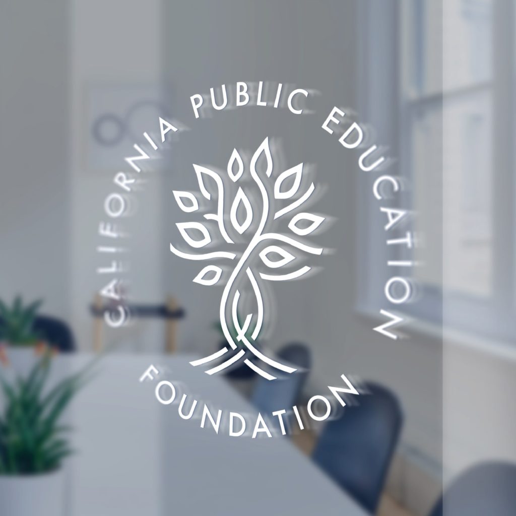
We created four logo concepts, along with mock-ups of how their designs might look on a letterhead / business card combo and vinyl office window sign. This allowed the decision-makers at CPEF to visualize how each logo would look in real-life applications.

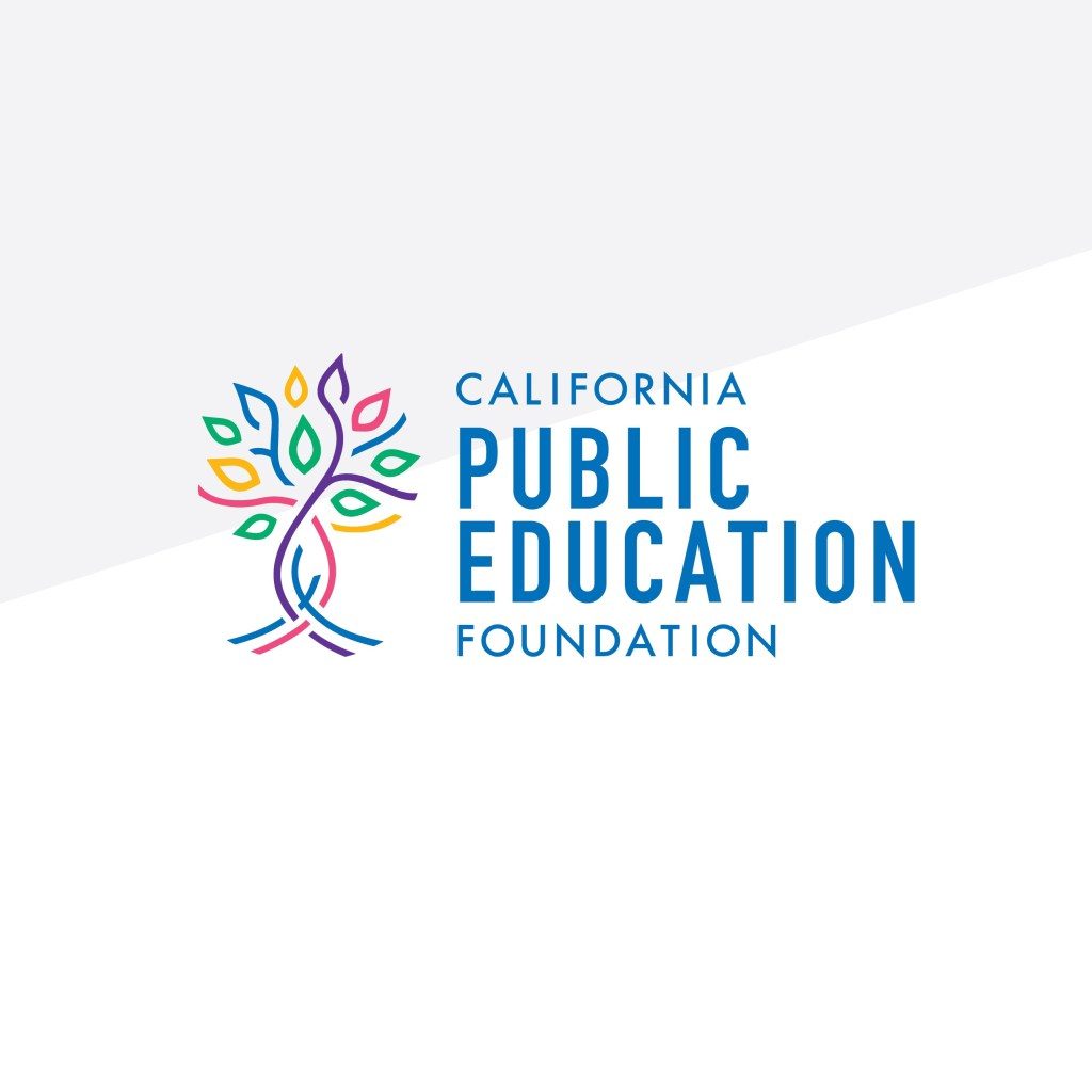
They decided on this icon, based on a bristlecone tree. These trees are native to California and have interlacing trunks and roots, which really represented how the foundation operates and what they hope to accomplish!

LAUNCH
Buttonwood Creative created a custom color palette, typeface and logo guide that will work as a great starting point for all future design projects within the organization. The new logo will be incorporated into the website design and other collateral associated with the organization and its programs. With two kids of my own currently entering the California public education system, this is definitely a cause I care about and am proud to have contributed to their mission!

Contact me for more information on how we can work together to create your unique brand!


