Periodontal + Implant Services
While I have had the opportunity to work with business owners all over the country, this client was special because they are located right here at home! There is a thriving community of entrepreneurs here in Haddonfield, and I had the pleasure of collaborating with Sharon Goldberg Interior Designs on this logo design project.
BACKGROUND
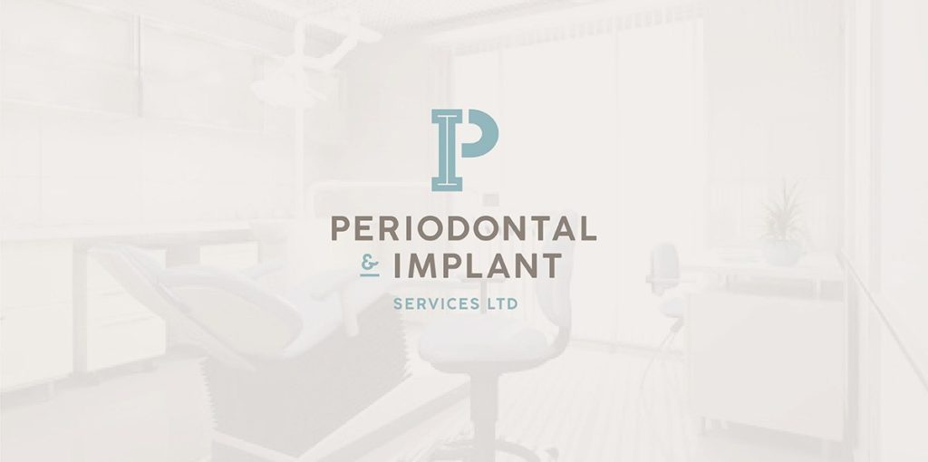
Sharon and I met up via the Haddonfield Swap & Sell group, and I’m so glad to have gotten to know her! She was in the midst of an interior renovation project for Periodontal + Implant Services LTD, a thriving dental practice with multiple locations in the Philadelphia area. The gorgeous new interior design featured modern fixtures, and a spa-like color palette of aqua blues, greens and neutrals.
She could see that the business needed a modern visual brand to match the new space, and reached out to me to update their logo design.
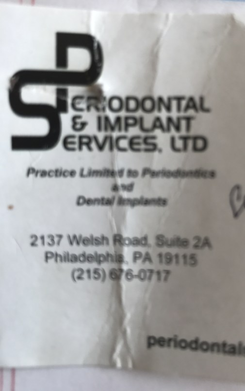
Drs. Schneider, Freedman and Friedman are specialists in periodontics and implantology. They provide professional, friendly and compassionate care to all patients, and are focused on building long term relationships. The new design needed to emphasize this friendly and comforting vibe, while maintaining the intersecting initials concept that their customers had come to know and recognize.
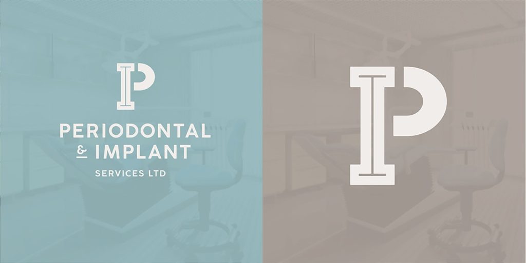
I suggested that the initials should now be “P + I” – reflecting their two core services: periodontics and implants. We agreed that the typeface should be updated for readability, and that the new logo design should coordinate with the office color scheme.
DESIGN PHASE
I designed four logo concepts with these parameters, along with mock-ups of how the concepts might look on printed materials and on a window in the office interior. This allowed her (and the Drs) to visualize how the designs would look in real-life applications.

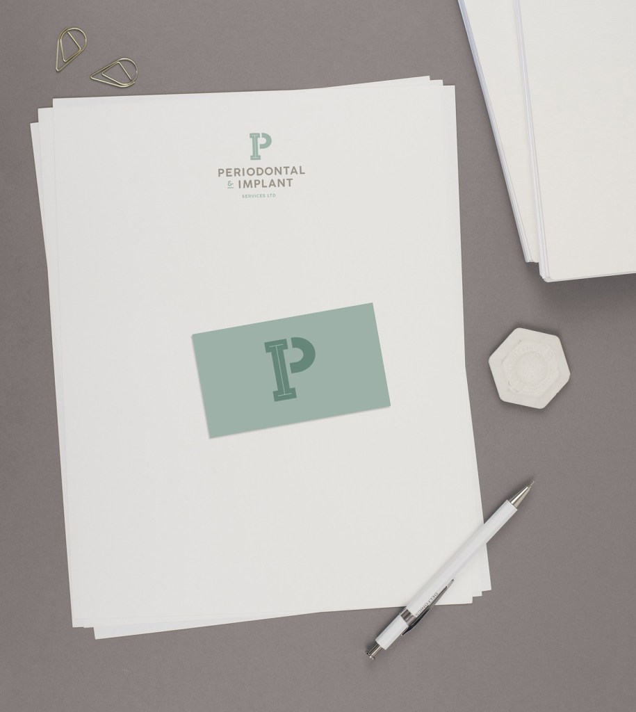
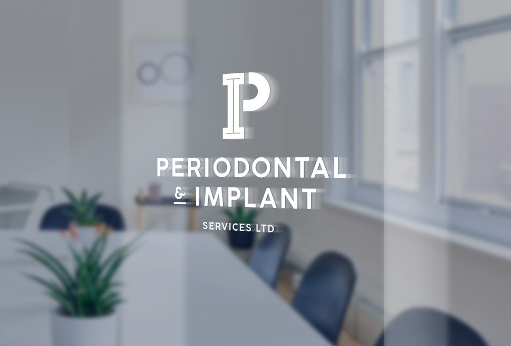
After some thoughtful feedback, we settled on the first concept, and tweaked the color palette until it was perfect. I am truly pleased with how this logo design came out! The business name can be a mouthful, so simple and readable were a must! The initials concept from their previous brand was preserved, but with a modern twist.
PRINT MARKETING
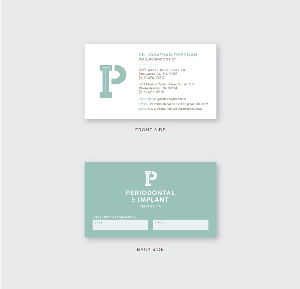
We also presented some business card concepts utilizing the new logo and color palette. I can’t wait to see how everything looks in their newly renovated space!
Contact me for more information on how we can work together to create your brand refresh!
