Professional Women’s Referral Group
After moving to the Bay Area, I joined the local chapter of PWRG in late 2019 after attending a mixer in Danville. I really connected with how supportive and welcoming everyone was. Since then, joining this group has helped me grow my business, and has provided a safe and supportive space for networking and self-promotion.
When I heard about the PWRG Marketing Task Force coming together to refresh the group’s brand and website, I definitely wanted to help.
Increase the success of our members’ individual enterprises • Create a supportive and non-competitive environment consisting of one person per industry • Create a forum for the discussion of ideas and concerns related to female entrepreneurs • Provide professional referrals and contacts • Mutually support and encourage each other in our chosen fields
pwrg mission statement
The rebranding process began with an awareness that the group’s website needed an update. And if you are going to invest the time and effort into a website refresh, it’s a great opportunity to also revisit your brand strategy and identity so that you’re putting your best foot forward.
The goals of the Task Force were to modernize and update the PWRG brand, create flexibility so that chapters can be added without much fuss, and lay out visual guidelines for website, social media, and collateral going forward.
DISCOVERY PHASE
The process began by conducting a survey and needs assessment – which went out to all current members of the group. We learned what the values of PWRG are, and what the differentiating characteristics are compared to other networking groups. This really informed the brand strategy.
PWRG already exuded these values: warm, collaborative, respectful, supportive – but the needs assessment told us that members also wanted to see the values: growth, development, connection, and diversity.
DESIGN PHASE
We wanted the logo design to highlight business building, as well as the collaborative nature of the group – especially how members wanted to see the group going forward. I explored visuals such as a graph moving upwards, a basketweave pattern, and a handshake, eventually developing a symbol highlighting the interactions and relationships between members, as well as business growth.

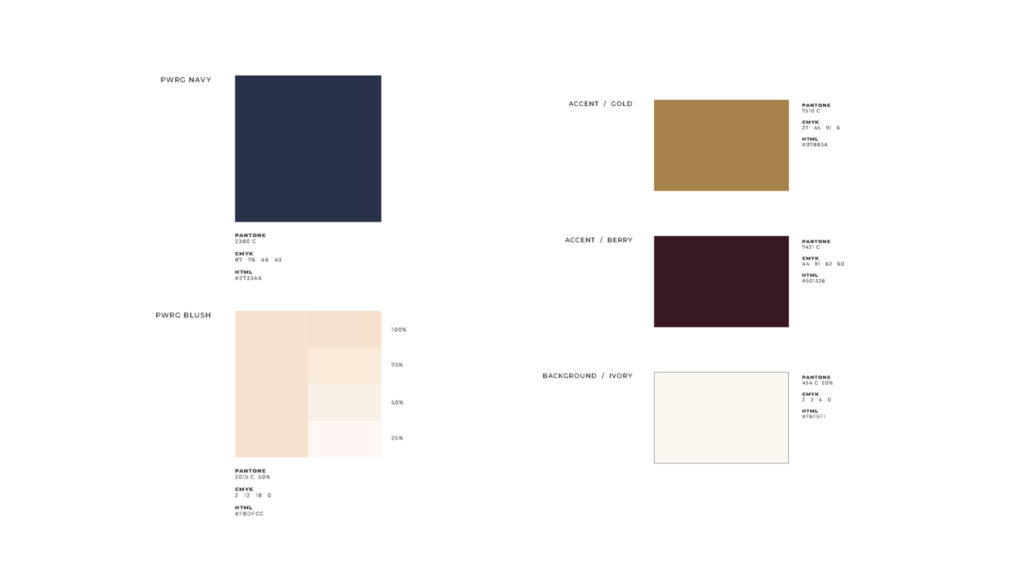
We took the existing blue color and the positive brand recognition that comes with it, and updated it. Pairing with this blush pink color brought in some much-needed femininity. The new logo is modern, unique, clean, bold and memorable.

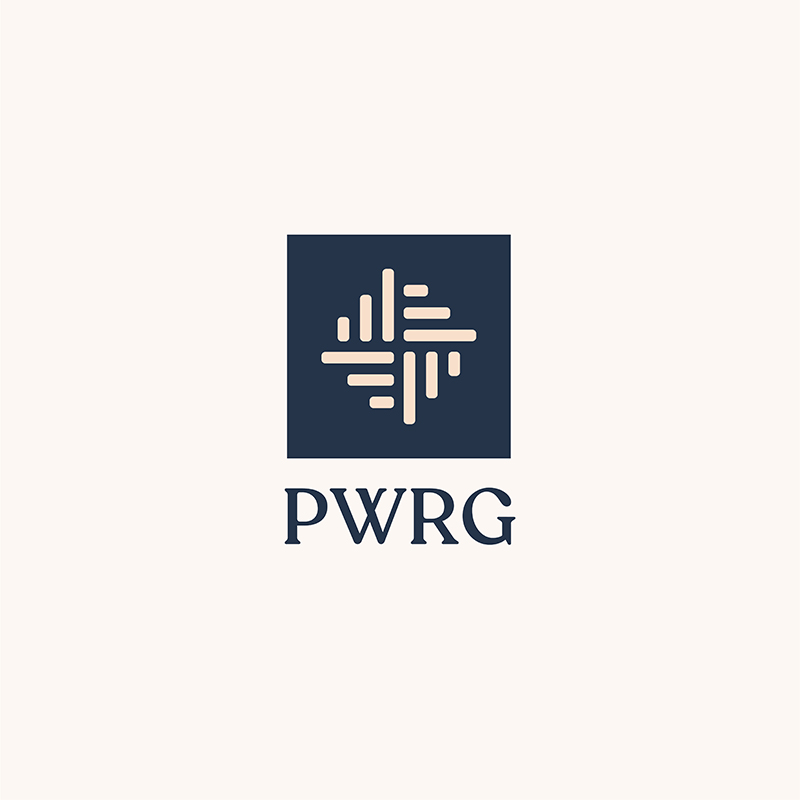


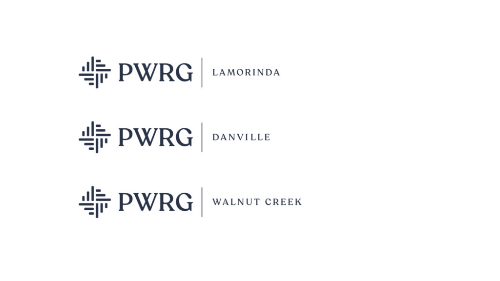
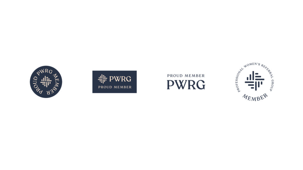
We also created a logo framework for the individual chapters. This gives each of the 7 chapters (Walnut Creek, Pleasant Hill, Danville, Concord, Lamorinda, Oakland, and San Ramon) its own distinct brand, and the design allows for the simple growth of additional chapters.
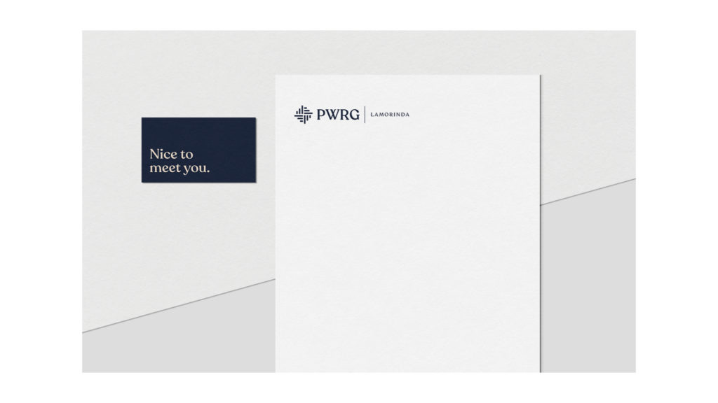
We developed a color palette consisting of the two primary brand colors, and some additional accent colors that can be used in social media posts, etc. – as well as typestyle guidelines, so that everything coming from PWRG looks cohesive and consistent to our audience.

EXECUTION
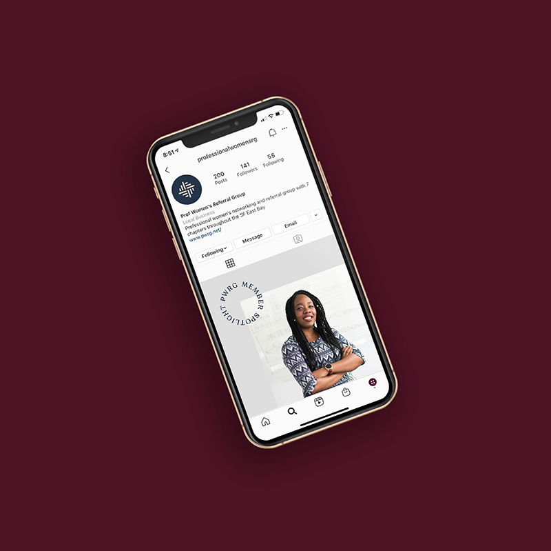
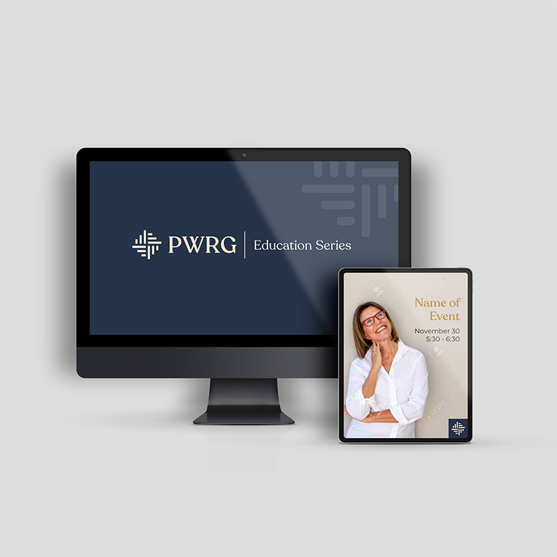
The basketweave mark is versatile, and can be used in a lot of interesting ways, such as a background pattern, or as a photo overlay.

Contact Lisa for more information on how we can work together to create your unique strategy and brand!
