Sweet Little Details
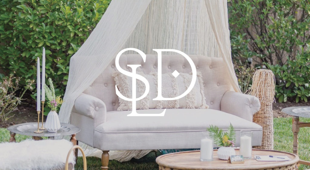
This wedding and event rental company hired Buttonwood Creative to create a complete visual branding package that would take them into the next phase of their business, as they invest in a delivery truck and retail storefront.
When Nicole was brainstorming a name for her business, she thought of the little details at her own wedding that made such a huge impact on the day. It was all those “sweet little details” that everyone talked about and loved.
It’s those sweet little details that leaves people walking away from an event and talking about later.
SWEET LITTLE DETAILS
Sweet Little Details rents out show-stopping furniture and specialty items (many pieces handmade by Nicole and her husband!) to clients who are planning their wedding and events.
They had initially created their own logo through an online service, but found it to be clunky and frustrating to work with. With only one version of the logo, it was difficult to fit it into a circle orientation on social media, for instance. Also, the handwritten font, which has been so popular in the wedding industry, was hard to read.
DISCOVERY PHASE
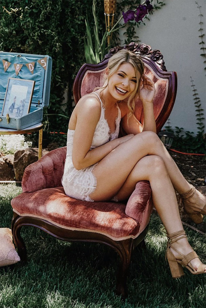
In our discovery, we agreed that a neutral black and white color palette would be fitting, in order to let the items and the personality of each bride shine.
The wording needed to the legible and give that vintage, feminine look.
Competitors were other specialty rental companies in the East Bay. Sweet Little Details stands out because of their boutique, vintage feel.
Adjectives we wanted to emphasize included natural, custom and beautiful.
DESIGN PHASE
After a thorough process of research and sketching, I presented multiple brand concepts ranging from playful and modern, to classic and timeless.
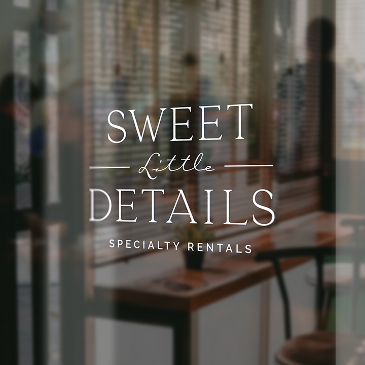
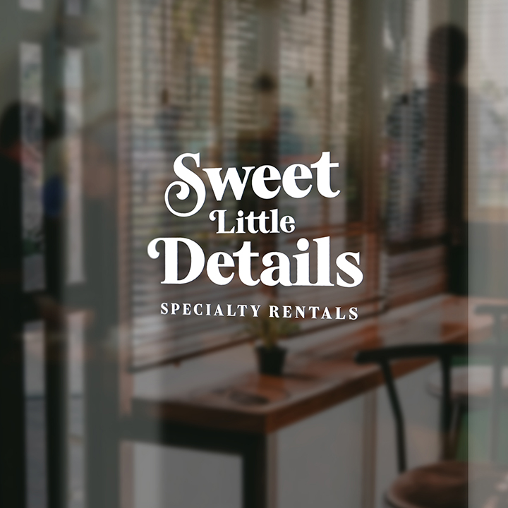
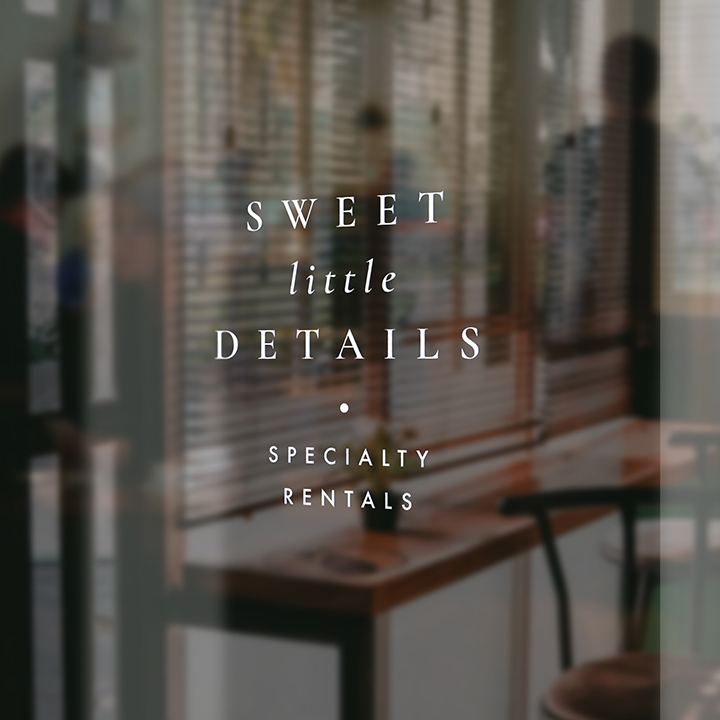
I felt that each suite of design elements uniquely positioned Sweet Little Details in the market and complemented the signature pieces that they make!
LAUNCH
The final brand identity design features a beautiful, classic typeface and configuration. It has an elegance that speaks to the wedding and event industry, but also has a down-to-earth quality.
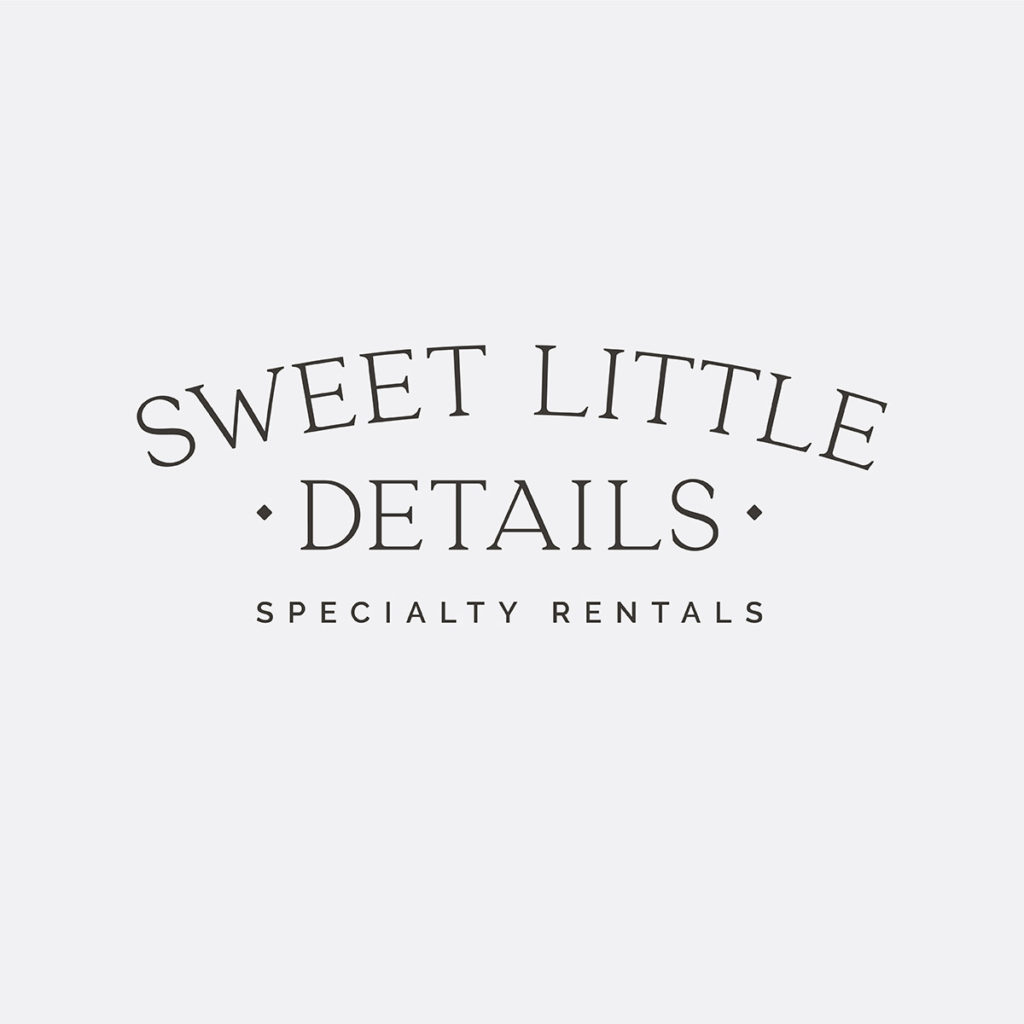

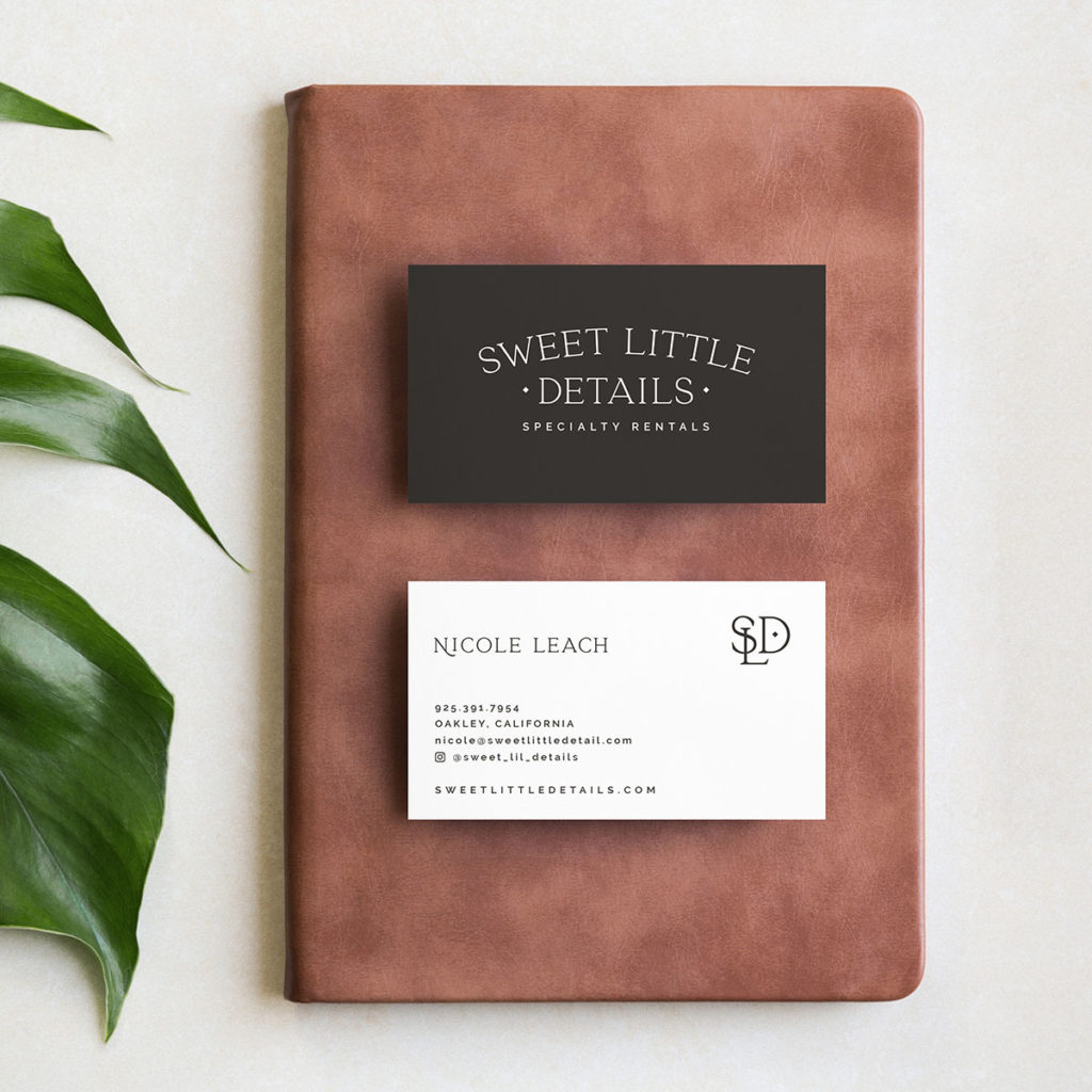
The monogram with small diamond alludes to weddings, elegance and quality. This pairing of two typefaces is truly classic and timeless. It is clean and simple, letting the unique rental items shine.
We recently completed a double-sided business card design with flood of faded black, and I look forward to executing these brand visuals on their new website, coming soon.
Contact Lisa for more information on how we can work together to create your unique brand!

